We first looked at instances of burglaries in the DC area. The first step of using the data was to use a SQL query to parse out particular instances were the offense is coded as a burglary. The next step was to see how many burglaries were committed within each census tract. This was done by creating a spatial join between the census tract layer and the burglaries. The join count field created by this spatial join shows how many burglaries occurred within that census tract. Some tracts were excluded because of a very low number of households in those areas skewed the results.
 |
| A choropleth map of the burglary rate per 1000 homes for each census tract in Washington DC. |
 |
| A kernel density map showing the assault rate in DC. |
Grid-based mapping used a grid of half mile squares. After isolating any squares with more than one homicide, I selected the top quintile (20%) to make a layer of the squares with the highest incidence rate of homicides.
 |
| Grid squares with the top quntile of homicides in Chicago. |
For the kernel density map, I used the kernel density tool on the same set of data as the previous map. I edited the symbology tool to identify where the homicide rate was triple the mean rate. I then used the reclassify tool so that the map that displayed the final values showed only the areas with triple the mean rate or higher.
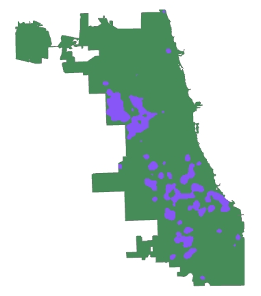 |
| The blue areas show where the homicide rate is triple the mean for Chicago. |
Moran's I is another hotspot method. After calculating the number of homicides per 1000 housing units for each census tract, I used the Cluster and Outlier Analysis (Anselin Local Moran's I) tool. This creates different spatial clusters, for this map I was interested in "high-high": areas with a hate homicide rate that were also close to other areas with a high homicide rate. A SQL query was then used to isolate out the high-high values to create the map.
 |
| Since Local Moran's I uses the census tracts it looks much more grid like in its results. |
Each of these methods produce different results. It is useful to compare them against each other when determining things like budget and resource allocation. The grid method identifies the smallest area but has a greater crime density. The kernel density method is between the other two methods in total area and density, but the amorphous zones may be difficult to easily navigate in reality. The Local Moran's I map has the highest total area but lowest density. However since it adheres to the census tracts it is easier to navigate than with kernel density. When compared applying data from the subsequent year, Local Moran's I also captures the highest percentage of future crimes within the hotspot.
No comments:
Post a Comment