Sunday, October 25, 2020

Remote Sensing - Visual Interpretation

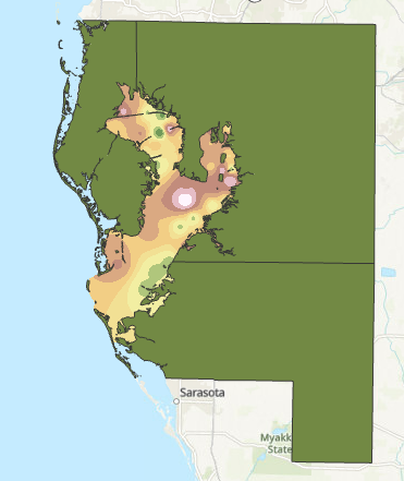
This week is the first week of remote sensing which means this is also the week of my last class for the graduate certificate in GIS.  Being the first week, this served as a introduction to different ways we can look at imagery to glean information from it.

For the first part, we went over tone and texture.  Tone is the lightness or darkness of an area which ranges from very light to very dark.  Texture is the coarseness of the of an area which ranges from very fine (like a still pond of water) to very coarse (an irregular forest).  These two elements lay down the building blocks of being able to identify elements of imagery photos.

Areas of different tone and texture isolated to show the variance.


In the second part of the lab, we explored other ways identify features.  Shape and size is the most basic of these.  By looking at the shape of something and comparing the size of what is around it you are able to determine what it is.  Pattern is good for noticing things like a parking lot through the paved lines for cars or the rows of crops in the field.  I looked at the shadows of things that were tall and narrow that are difficult to decipher what they are when looking directly above.  This technique is especially useful for things like trees or towers.  Association is where you look at the elements relative to one element to determine what it is.

Here I used different aspects such as shape and size, pattern, association and shadows to identify different elements within imagery.

In the last part of the lab we compared true color imagery against false color infrared (IR).  True color imagery is the same as what the human eye would typically see.  False color IR changes the way things are colored in the image.  The most obvious differences are that water becomes very dark and vegetation becomes red.  This false color imagery makes it more obvious to discern what certain elements of an image are.

Monday, October 12, 2020

Scale Effect and Spatial Data Aggregation


This week we investigated how scale has an impact on both raster and vector data.  We also looked at other issues such as the modifiable areal unit problem and how to measure gerrymandering.

To explore the impact on vector data, I compared three sets of data of streams and bodies of water at three different scales.  The larger scale data set had a much greater level of detail showing all the crenelations of each tiny stream, while the smaller scale data set provided a much greater generalization with a lower level of detail.

For the raster data, we were provided with a DEM LiDAR data set.  I then resampled the data at multiple resolutions ranging from 1 meter cells to 90 meter cells.  Then on those resampled layers, I ran the slope tool for each one and looked at the median slope.  The slope value decreases as the resolution becomes lower.  The lower resolution a data set, the less information it captures.

Gerrymandering is the act of drawing a political district to include certain populations and exclude others, in an effort to create a district that is more likely to vote in favor of the party delineating the district's boundaries.  Gerrymandering can be measured using the Polsby-Popper score which is calculated using 4π(Area of the District)/(Perimeter of the District^2).  This measures the level of compactness the district has.  The more compact it is, the closer to 1 the score will be.  Conversely, the closer to zero the score is the worse the boundary is.

The Congressional District 7 of Pennsylvania has a very low Polsby-Popper score of 0.04099574. This district was so blatantly gerrymandered that in 2018 the Supreme Court of Pennsylvania ruled that the boundaries had to be changed.

Sunday, October 4, 2020

Surface Interpolation

 Interpolation is a method for calculating a gradient of change across a surface using point data.  There are multiple different interpolation techniques that can be used to create these surfaces that each have their own pros and cons.  For this particular assignment, we had to use ArcGIS to produce interpolation surfaces using Thiessen polygons, IDW, and two different types of Spline interpolation (Regularized and Tension).

The Thiessen polygons method creates polygons around a single data and applies the value of the point to the polygon.  The IDW, or inverse distance weighted method, determines values by taking into account how close points are.  The further away a point is, the less this method takes into account its value when determining the value of a particular cell.  The spline method works likes a pliable sheet that bends itself through each one of the provided data points.  A regularized spline creates a smoother surface than a tension spline, as a tension spline is more constricted by the values provided by the data points.

The IDW method demonstrating the varying surface water quality within Tampa Bay.

Sunday, September 20, 2020

Surfaces - TINs and DEMs


This week the focus was on using and understanding DEMs and TINs.  DEMs are digital elevation models, and TINs are triangular irregular networks.  Both are remotely sensed imagery that are used to convey the three-dimensional surface of the Earth.  This can be used for a wide variety of applications that require knowledge of what the terrain looks like.

DEMs and TINs are similar in many ways but there are differences between the two (Bolstad 2016, 68).  The most obvious difference is that is a DEM is a raster and a TIN is a vector.  The other major difference is that a TIN is able to convey elevation, slope, and aspect simultaneously while a DEM must be geoprocessed into three different layers to show each one of those elements.


TINs can be symbolized to emphasized different characteristics such as slope.  It is also possible to apply an outline to the edge of each triangle, so that when you are looking to click on a particular triangle to find its information it is easier to identify a single one.  Contour lines may also be applied so that differences in elevation are easier to discern.

Bolstad, P. (2016). GIS Fundamentals: A First Text on Geographic Information Systems (5th ed). Eider Press.

Sunday, September 13, 2020

Data Quality Assessment


The goal of this week's lab was to determine the completeness of two separate road networks for Jackson County, OR.  One of the networks was the TIGER file which is created by the US Census Bureau, and the other was created by the county's GIS team.  The methodology for determining completeness was based off of the method used by Haklay (2010) where the study area was broken into grid squares of equal area and the total length in difference between the two networks was compared.  The network with longer road distance in each particular grid square was considered to be more complete.  This was mapped by using the percent difference which was calculated by (total length of Jackson County-created network - total length of TIGER network)/(total length of Jackson County-created network) * 100.

When looking at the county as a whole, the TIGER network is more complete as it has a little more than 500 km of road than the network made by the Jackson county team.  However, as shown in the map below, this does not mean that the TIGER network is more complete in all areas.  The Jackson County team network was more complete for 45.27% of the grid squares, and the TIGER network more complete for 54.73% of the grid squares.

A comparison of completeness between the two road networks.  The pink areas are where the TIGER network is more complete, and the green squares are where the Jackson County-created network is more complete.

Haklay, M. (2010). How Good is Volunteered Geographical Information? A Comparative Study of OpenStreetMap and Ordnance Survey Datasets. Environment and Planning B: Planning and Design, 37, 682-703. doi:10.1068/b35097

Saturday, September 5, 2020

Data Quality

Continuing with the same focus of last week on positional accuracy, we compared two different road networks of the city of Albuquerque for positional accuracy.  The first network tested was made by the city of Albuquerque itself and the second was made by StreetMapUSA.  As to be expected, the network produced by the city of Albuquerque was considerably more accurate of the two since they have a much greater vested interest in having an accurate map of their own city (e.g. for properly dispatching ambulances for 911 calls).

To compare the accuracy of a network map you need to have a reference map to work from.  For the independent reference points we used the orthographic satellite photos to find intersections that exist on both map networks.

The next step of the positional accuracy process is to set the points.  Each point for both networks and the ortho photos has to be for the same intersection.  It is also important to get an even spread of points across the study area.  For best accuracy, greater than 20% of the points should be present in each quadrant and the points should be spaced out from one another.  At least 20 test points are required for reliable results.

After picking the points and then exporting them to an Excel spreadsheet, I took that raw data to process the accuracy assessment.  For each point on the network, the difference in the latitude and longitude is found.  Then, that difference is squared.  And the squared difference of both latitude and longitude are added together.  The sum of the squared differences is calculated, and then the average of that sum is also calculated.  Finding the square root of the average of the sum of the difference in latitude and longitude squared gives the RSME.  Multiplying the RSME by a provided value (in this case, the National Standard for Spatial Data Accuracy statistic determines that to be 1.7308 for horizontal accuracy) gives the final NSSDA value.  The lower the value the better the positional accuracy.


A road network map with the associated points for the intersections.  Both of the network layers and the reference points (from the ortho imagery) each had their own set of 20 points that all corresponded to like intersections.

The final results on accuracy are as follows:

Streetmap:
Tested 478.683 feet horizontal accuracy at 95% confidence level

Vertical positional accuracy: not applicable 

ABQ:

Tested 21.669 feet horizontal accuracy at 95% confidence level Vertical positional accuracy: not applicable


Thursday, August 27, 2020

Calculating Spatial Data Quality

This fall I begin Special Topics in GIS as I enter the last semester for my graduate certificate in GIS.  This week's focus was on methods of calculating spatial data quality.

The first task was to calculate the horizontal and vertical data accuracy and precision based off of data acquired from a handheld GPS device.  Accuracy is how close values are to an accepted reference value.  While precision is how close values are to one another (for example, a cluster of GPS points from the same device measuring the same spot would all be precise).

We started with a collection of GPS points that were all recording the same location.  Then, to find the average of the points I found the mean latitude and longitude values of all the collected GPS points and created a new average point of all of them in its own feature class.

Next, I made a multi-ring buffer around this average point.  I calculated the distances for each buffer by finding what the values would be for where 50%, 68%, or 95% of the points are within the buffer.  I found the index for each particular percentile by taking the waypoints feature class that was spatially joined with the average point to create a new distance field and then multiple the total number of waypoints by the desired percentile to find the corresponding index value.  This index value is the distance at which that percentile of points would be inside of the buffer.  This method of creating a multi-ring buffer is to show how precise the data collection process was.


68% of the points in this data collection fell within 4.4 meters of the location of the averaged waypoint.

Another important feature of data quality is to measure the accuracy of the data.  We did this using data from an absolute reference point that was established outside of the data collection process.  The majority of this work was done in Microsoft Excel using .dbf files.  I used waypoint data and compared it against benchmark data to calculate the values that were used in the cumulative distribution function graph. 

Consulting this graph shows the likelihood that a given value will be within that distance from the reference point.  This particular GPS device only has about a 10% chance of being within a meter of the reference point for any particular reading.


The CDF shows how likely it is for a point measured using the GPS to be a certain distance from a reference point.  Knowing the accuracy of a GPS device is important since some project may suffer from poor data accuracy.